Automation dashboard case study: clearer operations and less admin after enquiries or orders.
A practical case study outline showing the commercial thinking behind the design, content, mobile experience, SEO structure and expected business outcome.
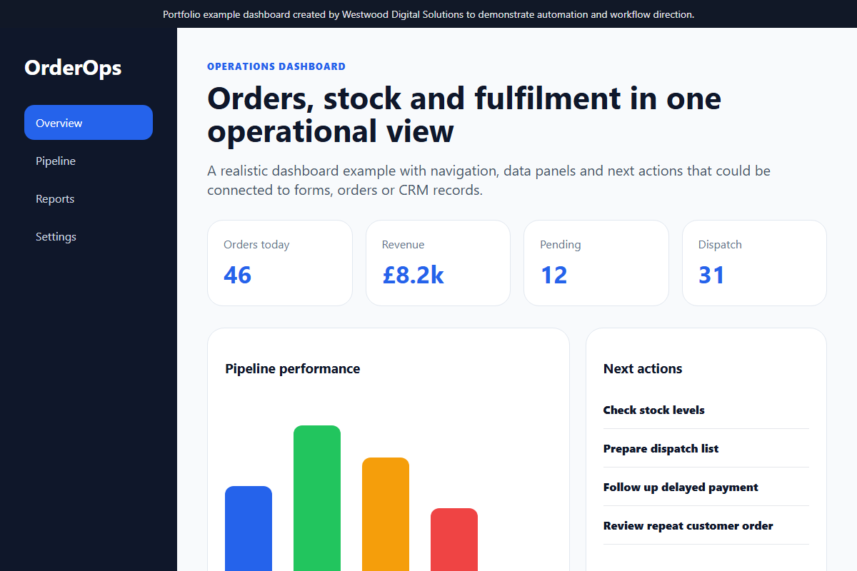
The problem
Growing businesses often collect enquiries and orders without a clear view of status, value, source or next action, which creates admin drag and missed follow-ups.
The solution
The dashboard direction brings key workflow data into one view so the business can see orders, leads, revenue, fulfilment and activity at a glance.
Features built
Order summary, revenue cards, fulfilment status, enquiry source tracking, action lists, reporting-ready data structure and workflow visibility.
Mobile view
The mobile view focuses on quick status checks, priority actions and compact reporting rather than dense spreadsheet-style screens.
SEO considerations
SEO considerations apply to the public website feeding the dashboard: structured enquiry forms, clear service pages, conversion tracking and useful event data.
Expected business outcome
Expected outcomes include faster follow-up, fewer missed actions, clearer reporting and less time spent manually checking disconnected systems.
Want work like this, but scoped around your business?
Send your current website, product range or workflow problem and I will suggest practical next steps.
Commercial objective
The aim of this automation dashboard concept is not only to make the business look more professional. The aim is to create a website that can support real sales conversations: clearer positioning, stronger trust, better mobile usability and a more structured route from first visit to enquiry or order.
Discovery and planning
For a service business, the planning stage starts with the customer journey. Visitors need to understand what is offered, whether the business serves their area, what makes it different, and what action to take next. The page structure is designed around those questions rather than around generic brochure sections.
Design decisions
The visual direction uses clear hierarchy, strong calls-to-action, readable sections and proof-led content. The design avoids clutter and gives priority to lead tracking, workflow visibility and follow-up automation. This makes the site easier to use on mobile, where most local buyers will first inspect the business.
SEO structure
- Descriptive page title and single clear H1.
- Service-led headings using natural customer language.
- Internal links to relevant services and contact pages.
- Image alt text written for context, not keyword stuffing.
- Schema markup and sitemap inclusion where the page should be indexed.
Result expected
The expected result is a website that feels credible immediately, explains the offer without confusion and reduces the number of weak or repetitive enquiries. For a small business, that matters because better-qualified leads save time and improve the chance of turning website traffic into actual revenue.
How this can be adapted
The same structure can be adapted for trades, food businesses, clinics, e-commerce stores and professional services. The industry changes, but the commercial framework stays the same: clear offer, local relevance, proof, simple enquiry route and measurable follow-up.