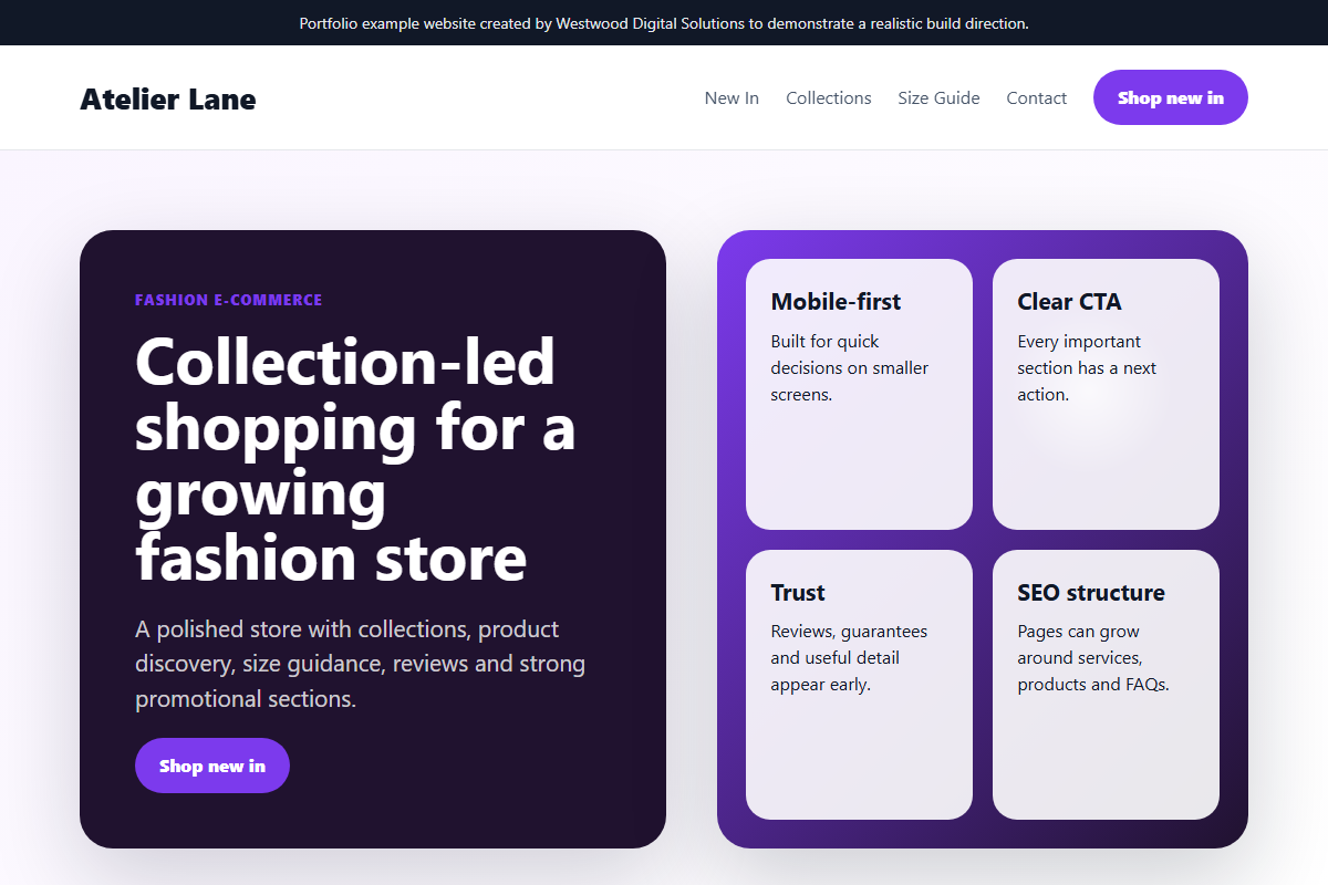
Fashion e-commerce case study: collection-led product discovery and smoother buying flow.
A practical case study outline showing the commercial thinking behind the design, content, mobile experience, SEO structure and expected business outcome.
The problem
Fashion shoppers need fast collection browsing, clear product cards, strong promotional messages and a basket route that does not interrupt discovery.
The solution
The design direction uses collection-led merchandising, best-seller sections, visual product cards, offer prompts and a simple route from browsing to basket.
Features built
Collection sections, product cards, promotion panels, basket preview, mobile-first navigation, trust cues and conversion-focused product pathways.
Mobile view
The mobile experience keeps product cards readable, reduces navigation friction and keeps the basket and offers visible without overwhelming the shopper.
SEO considerations
SEO considerations include collection landing pages, product metadata, image alt text, internal links, structured product categories and crawlable content sections.
Expected business outcome
Expected outcomes include better product discovery, increased basket starts, clearer promotion visibility and a more polished store experience.
Want work like this, but scoped around your business?
Send your current website, product range or workflow problem and I will suggest practical next steps.
Commercial objective
The aim of this fashion e-commerce store concept is not only to make the business look more professional. The aim is to create a website that can support real sales conversations: clearer positioning, stronger trust, better mobile usability and a more structured route from first visit to enquiry or order.
Discovery and planning
For a independent fashion retailer, the planning stage starts with the customer journey. Visitors need to understand what is offered, whether the business serves their area, what makes it different, and what action to take next. The page structure is designed around those questions rather than around generic brochure sections.
Design decisions
The visual direction uses clear hierarchy, strong calls-to-action, readable sections and proof-led content. The design avoids clutter and gives priority to category browsing, product storytelling and checkout planning. This makes the site easier to use on mobile, where most local buyers will first inspect the business.
SEO structure
- Descriptive page title and single clear H1.
- Service-led headings using natural customer language.
- Internal links to relevant services and contact pages.
- Image alt text written for context, not keyword stuffing.
- Schema markup and sitemap inclusion where the page should be indexed.
Result expected
The expected result is a website that feels credible immediately, explains the offer without confusion and reduces the number of weak or repetitive enquiries. For a small business, that matters because better-qualified leads save time and improve the chance of turning website traffic into actual revenue.
How this can be adapted
The same structure can be adapted for trades, food businesses, clinics, e-commerce stores and professional services. The industry changes, but the commercial framework stays the same: clear offer, local relevance, proof, simple enquiry route and measurable follow-up.