Food business website case study: local trust, product clarity and simple ordering routes.
A practical case study outline showing the commercial thinking behind the design, content, mobile experience, SEO structure and expected business outcome.
The problem
Food businesses need to show quality, explain collection or delivery, present products clearly and make ordering feel simple for local customers.
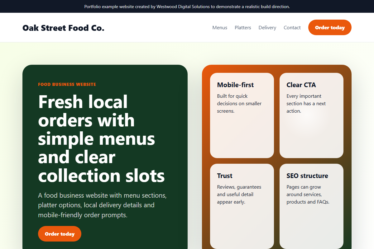
The solution
The website direction combines strong food imagery, clear categories, delivery or collection messaging, trust signals and ordering prompts that work on mobile.
Features built
Product sections, box or menu highlights, delivery messaging, local SEO structure, enquiry or order routes, trust cues and simple content management planning.
Mobile view
The mobile view prioritises product scanning, delivery information, tap-to-contact routes and fast movement from interest to order.
SEO considerations
SEO considerations include local food business searches, product/category pages, service-area wording, image alt text, FAQ content and internal links to e-commerce services.
Expected business outcome
Expected outcomes include stronger local trust, clearer product presentation, more direct enquiries or orders and a better platform for seasonal campaigns.
Want work like this, but scoped around your business?
Send your current website, product range or workflow problem and I will suggest practical next steps.
Commercial objective
The aim of this food business website concept is not only to make the business look more professional. The aim is to create a website that can support real sales conversations: clearer positioning, stronger trust, better mobile usability and a more structured route from first visit to enquiry or order.
Discovery and planning
For a meal prep and food service brand, the planning stage starts with the customer journey. Visitors need to understand what is offered, whether the business serves their area, what makes it different, and what action to take next. The page structure is designed around those questions rather than around generic brochure sections.
Design decisions
The visual direction uses clear hierarchy, strong calls-to-action, readable sections and proof-led content. The design avoids clutter and gives priority to menu clarity, product trust and fast enquiry flow. This makes the site easier to use on mobile, where most local buyers will first inspect the business.
SEO structure
- Descriptive page title and single clear H1.
- Service-led headings using natural customer language.
- Internal links to relevant services and contact pages.
- Image alt text written for context, not keyword stuffing.
- Schema markup and sitemap inclusion where the page should be indexed.
Result expected
The expected result is a website that feels credible immediately, explains the offer without confusion and reduces the number of weak or repetitive enquiries. For a small business, that matters because better-qualified leads save time and improve the chance of turning website traffic into actual revenue.
How this can be adapted
The same structure can be adapted for trades, food businesses, clinics, e-commerce stores and professional services. The industry changes, but the commercial framework stays the same: clear offer, local relevance, proof, simple enquiry route and measurable follow-up.